The Best Currency Animations of All-Time
Past core loop, three Cs, and KPI breakdowns lie currency animation breakdowns. It’s an animation that may well play hundreds of thousands of times during a player’s lifecycle; benefits compound. And yes, I really think the animation is just satisfying.
Economy design maintains a UX component. It’s vital for the designer to draw the cause <> effect loop between action and reward for the player. Currency animations, played when players claim or complete a task for a reward, stitch the acts into an experience. Wallet amounts don’t magically increase; the currency flows from the claim button to the wallet’s UI location.

The animations amount to a classically conditioned injection of dopamine, not so dissimilar to the original story of classical conditioning-centering on audio-visual reward cues. In that story, Russian scientist Ivan Pavlov presented a stimulus (not a bell!) before feeding a group of dogs. He would collect and measure saliva volume samples after the trigger but before giving the food. Eventually,
[…] Pavlov noted that the dogs would often begin salivating in the absence of food and smell. He quickly realized that this salivary response was not due to an automatic, physiological process.
Based on his observations, Pavlov suggested that the salivation was a learned response. Pavlov’s dog subjects were responding to the sight of the research assistants’ white lab coats, which the animals had come to associate with the presentation of food. Unlike the salivary response to the presentation of food, which is an unconditioned reflex, salivating to the expectation of food is a conditioned reflex. [1]
Acquisition of a currency is a step removed from acquiring the items the currency can purchase—the time between acquisition and disposal of currency forms anticipation.
Principles of Great Currency Animation
Great currency animations:
- Show the currency directly entering the wallet UI location
- Ensure the currency reward is hard to ignore
- Make the player feel rich while not cheapening the currency signal (i.e., animate more currency than rewarded)
- Match animations to powerful audio cues
Mobile Legends Adventure, above, doesn’t showcase a wallet drop-down and violates 3. (notice the number of purple diamonds, it’s less than 200—the actual reward). The audio leaves much to be desired as it only sounds like a single gem has been earned (4. fails).
Game Dev Tychon
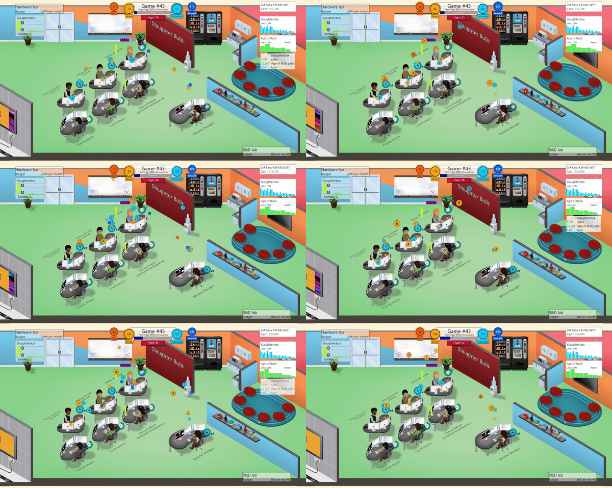
The sheer volume of icons is impressive, but the art communicates low-value “points” instead of currency. The currency flow from the computers to the UI location demonstrates the type of assets each programmer accrues. Unfortunately, the sound is lightweight, and thus the reward feels light.
Spyro
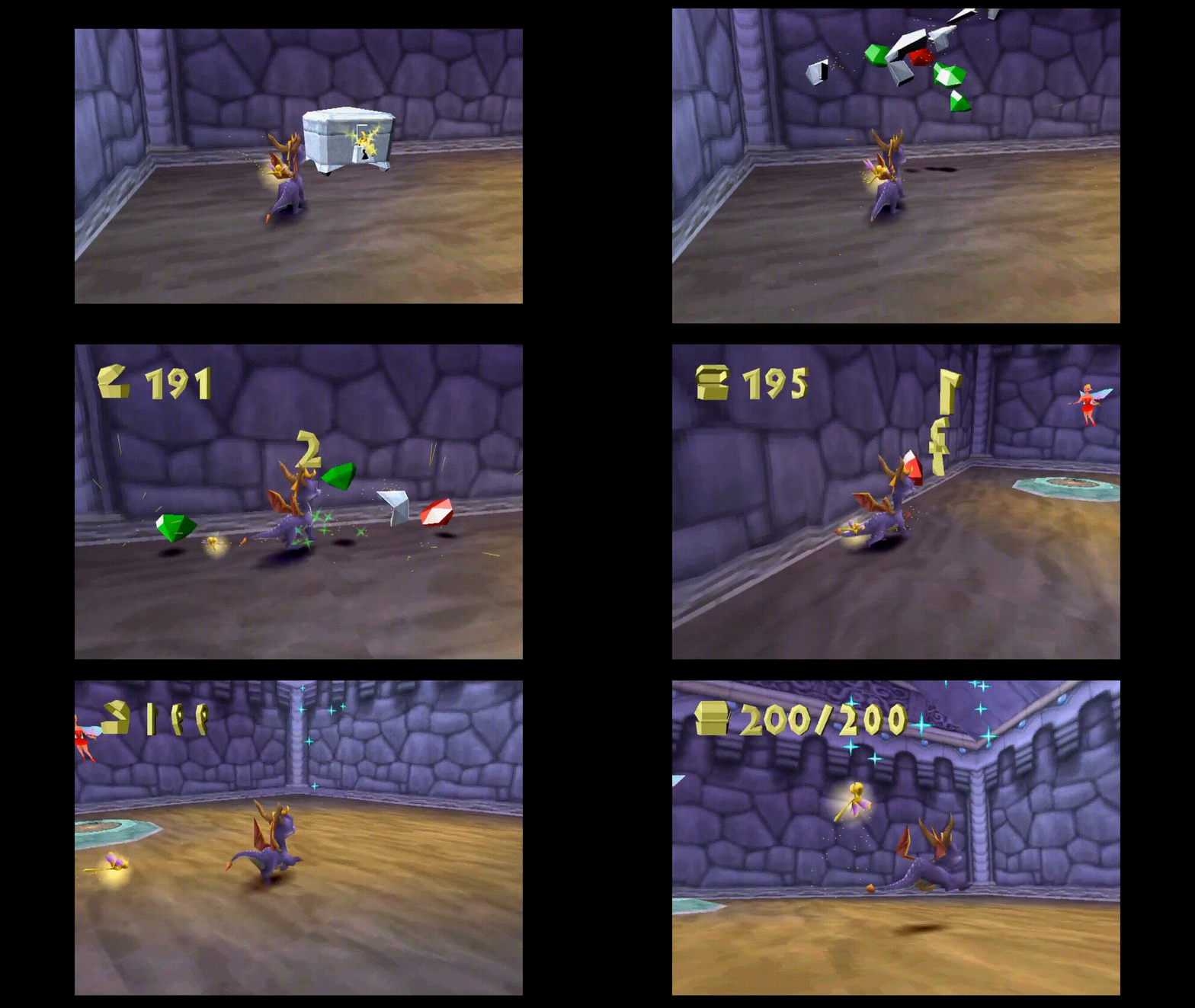
The gems convert to bouncing numbers on collection, providing a visual firework of sorts. The gem sounds are traditional, but the sound scoring effect is dated. Spyro may have very well helped pioneer the “zone of attraction” effect whereby a player “sucks in” currency around them.
Clash Royale
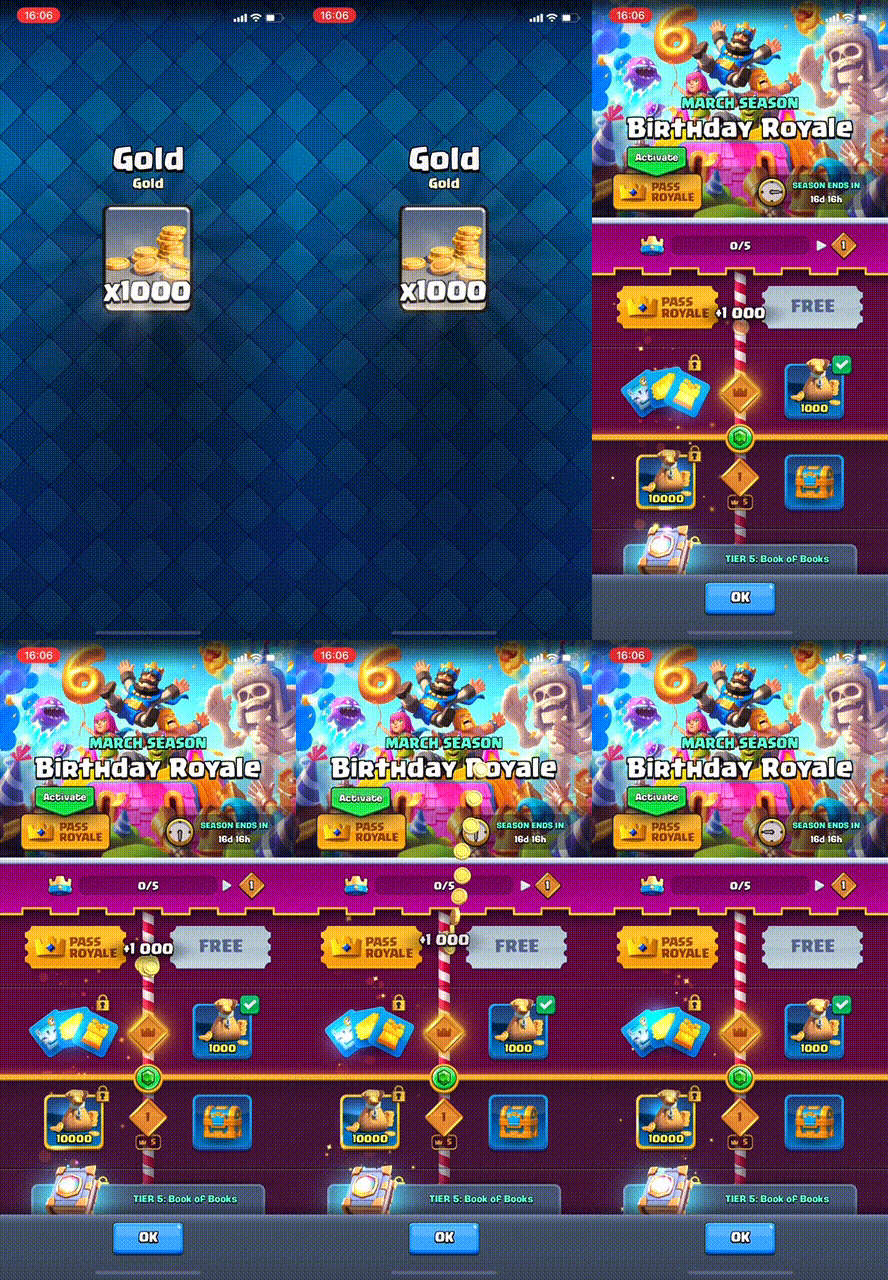
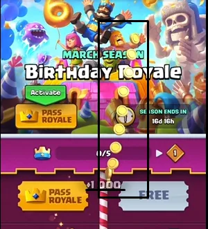
The audio design is top-notch, and so is the UX flow. Players always hit the main menu after receiving gold, so the connection between chest reward and gold balance increase is tight. The sounds indicated a TON of coins. Suddenly I’m Scrouge diving into a pile of copper coins. The only downside is seeing the gold form a straight line in the animation, thereby minimizing the total visual impact.
Runner-Up: Beatstar

Beatstar’s UI oozes sex. It’s as if someone who exclusively works from home in red velvet bathrobes developed it. The UI art merges with animation; coins flip and spin, reflecting light when they enter a player’s balance. The artist again uses the motif of spinning objects with track stars, mimicking the opening of the Paramount “Mountain Credits.”

Oh my, the music. Everything feels like it’s reverberating from a subwoofer, almost underlining the importance of the reward. Each currency gets a unique sound profile so players can differentiate on sound alone.
Winner: Brawl Stars
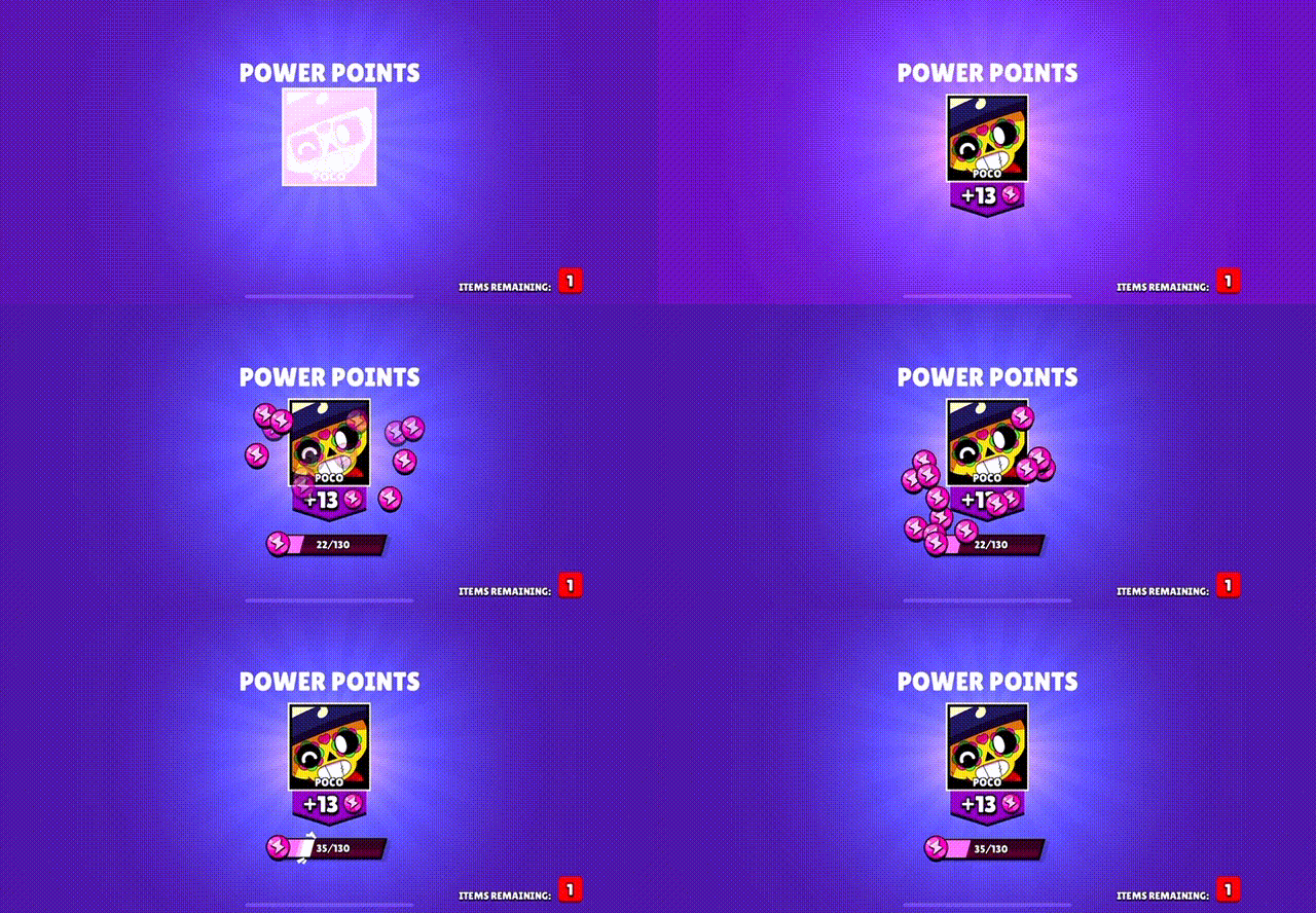
Surprise, surprise, it’s another Supercell win, but to be fair, Brawl Stars deserves it. The currency pauses, mid-animation, ensuring players admire it, before directly adding the currency to the power point bar. The amount of currency, in this case, 13 units, is the exact amount added to the power point bar. It’s impossible to miss as the currency spreads around the character portrait (“Poco”) rather than form a direct line, as we saw with Clash Royale.
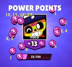
The audio suggests chips instead of coins, a refreshing break, but the improvement of the power point bar suggests an almost score-like element.